Press & Brand
Everything you need to write about or link to .takes — the logo, wordmark, colors, and type. Please keep the mark intact and give it room to breathe.
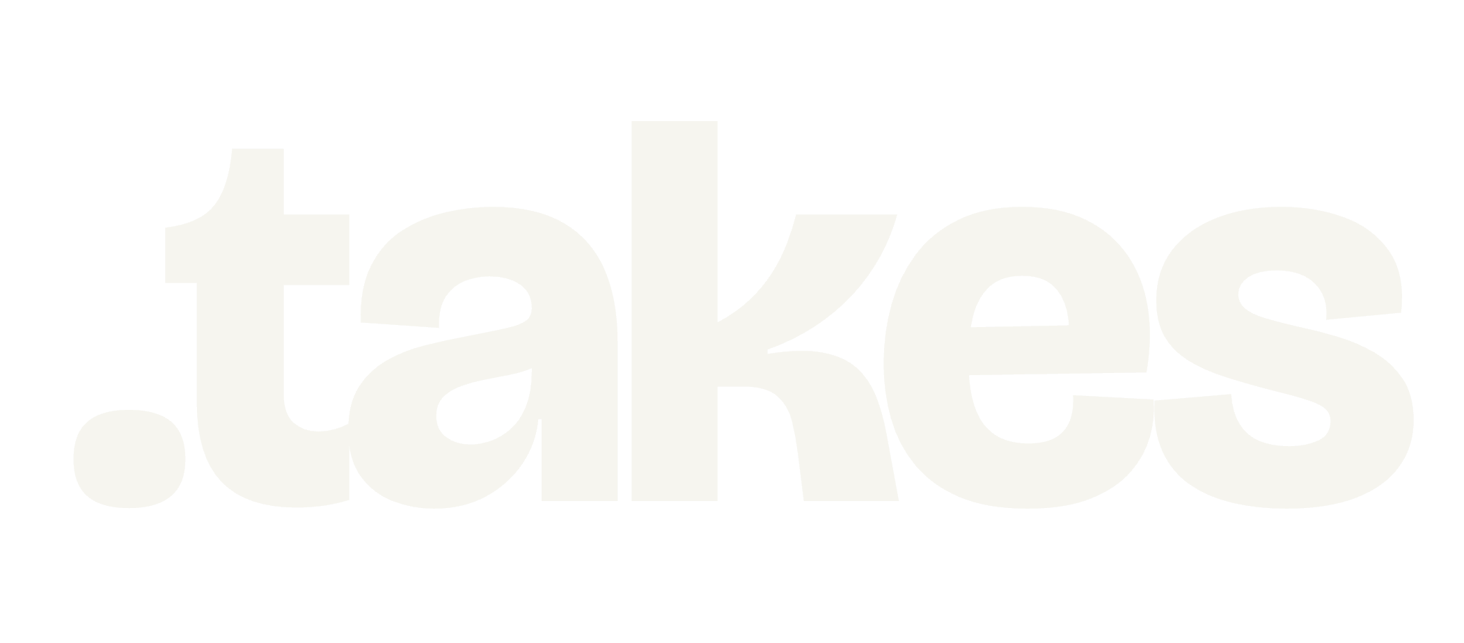
Logo
.takes
.takes
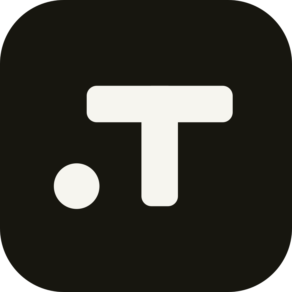
The app mark: the leading dot + T. Use the filled tile for app icons and avatars; use the monochrome mark on light surfaces.
Please do
Keep the leading period — it's the whole name. Give the mark clear space. Use ink on light, paper on dark. Scale it proportionally.
Please don't
Don't drop the dot, recolor the mark, add effects or outlines, stretch it, or set the name in a different typeface.
Color
A monochrome, warm-grey newsprint system. Ink on paper does almost all the work; the purple accent appears only to mark your own activity.
Typography
Bricolage Grotesque — Wordmark only — the .takes logotype. Weight 800.
Google Fonts →Space Grotesk — Display — headlines, take titles, numbers. Weights 500–700.
Google Fonts →Hanken Grotesk — UI & body — chrome, comments, fine print. Weights 400–800.
Google Fonts →About / boilerplate
.takes is a place to argue about everything. A take is a provocative, debatable claim with up to twenty options. Anyone can vote in one tap — no account — and watch live results fill in as solid black bars. When you're ready to talk back, pick a name and jump into threaded comments.
One line: “Everything is arguable. Cast your vote.”
Contact
Press & partnerships: press@dottakes.com